Ablocate
Logo Design | Ablocate | PK 🇵🇰
Ablocate bridges the gap between top IT professionals and forward-thinking companies. Simplify recruitment with tailored solutions, ensuring the right talent meets the right roles efficiently. Whether someone hiring or seeking job, Ablocate makes IT recruitment seamless and impactful.
Design:
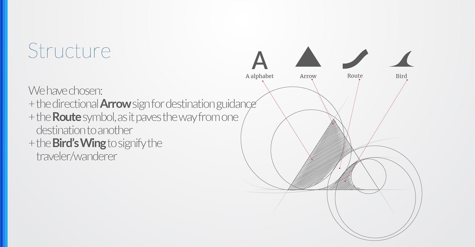
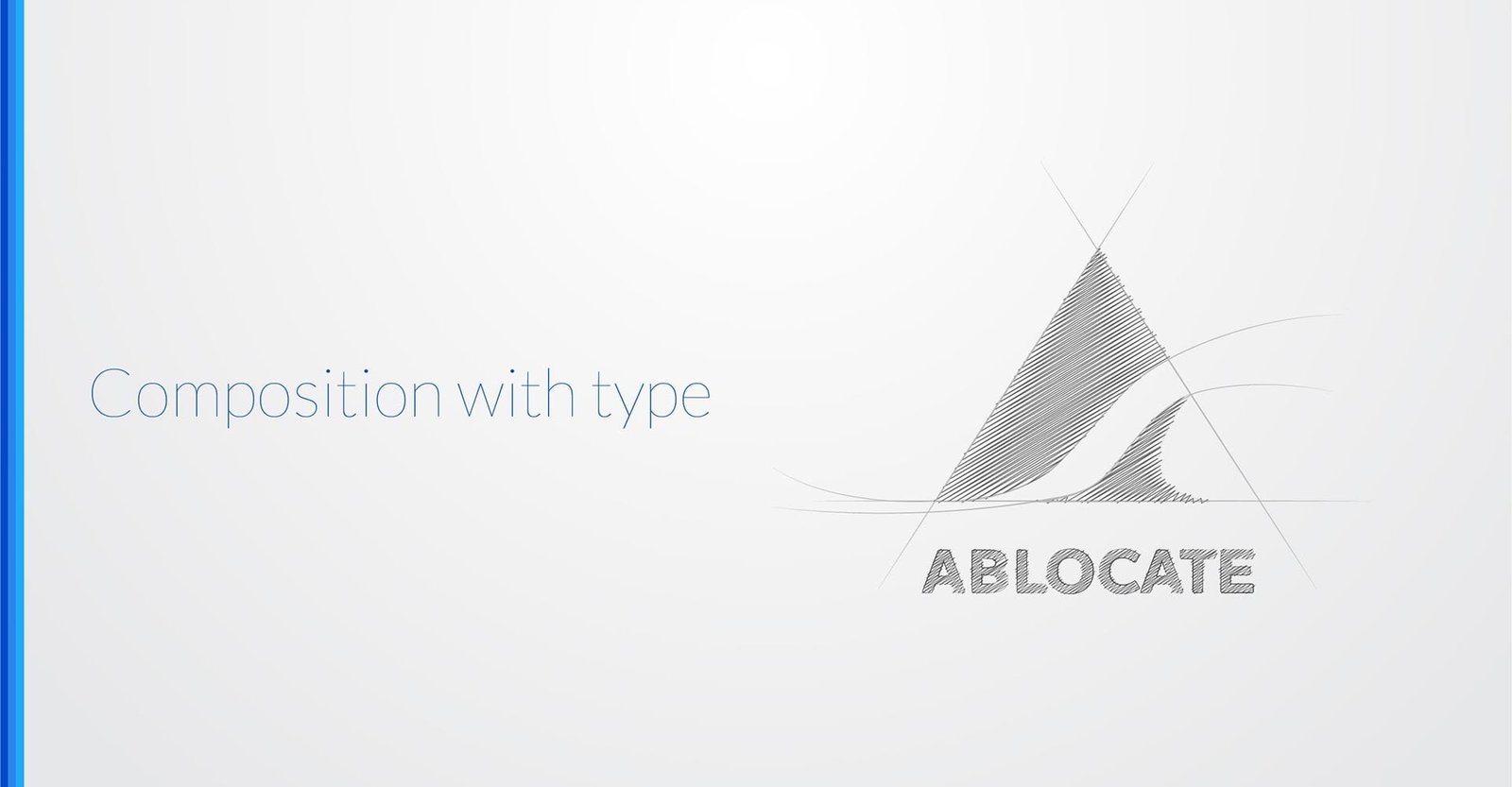
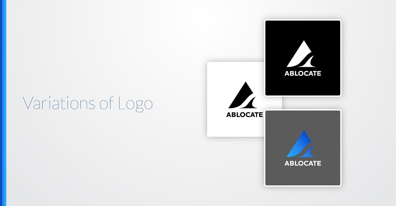
I combined three symbols—an arrow, a route, and a bird—to form the letter “A”, which represents the brand’s initial. This composition conveys direction, movement, and freedom, aligning with the brand’s identity and purpose.
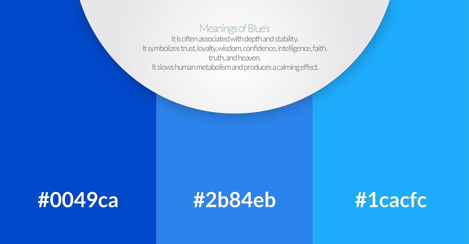
I chose tints of blue hues for the logo to evoke trust, loyalty, and wisdom. Blue is known for its calming effect and ability to slow human metabolism, creating a sense of stability and serenity.
