Klipda
Logo Design | Klipda | PK 🇵🇰
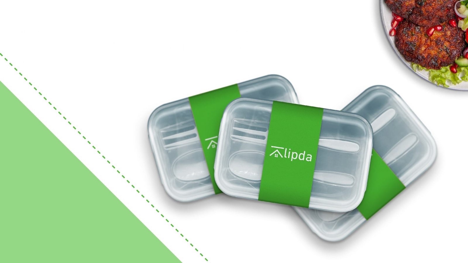
Klipda redefines convenience with speedy food delivery from people’s favorite local eateries. Bringing fresh, delicious meals straight to the doorstep, ensuring quality and satisfaction every time. Great food, just a click away.
Design:
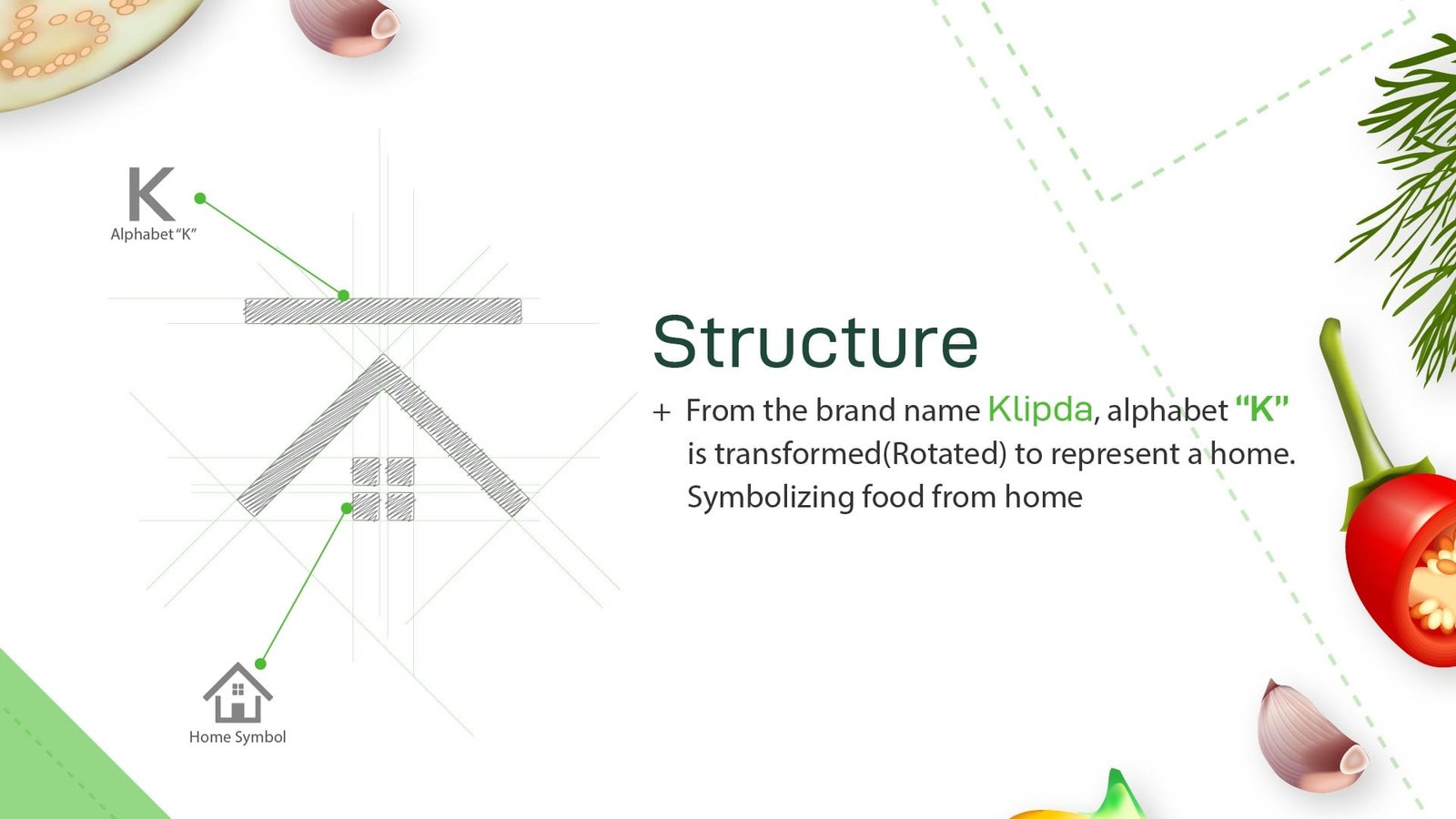
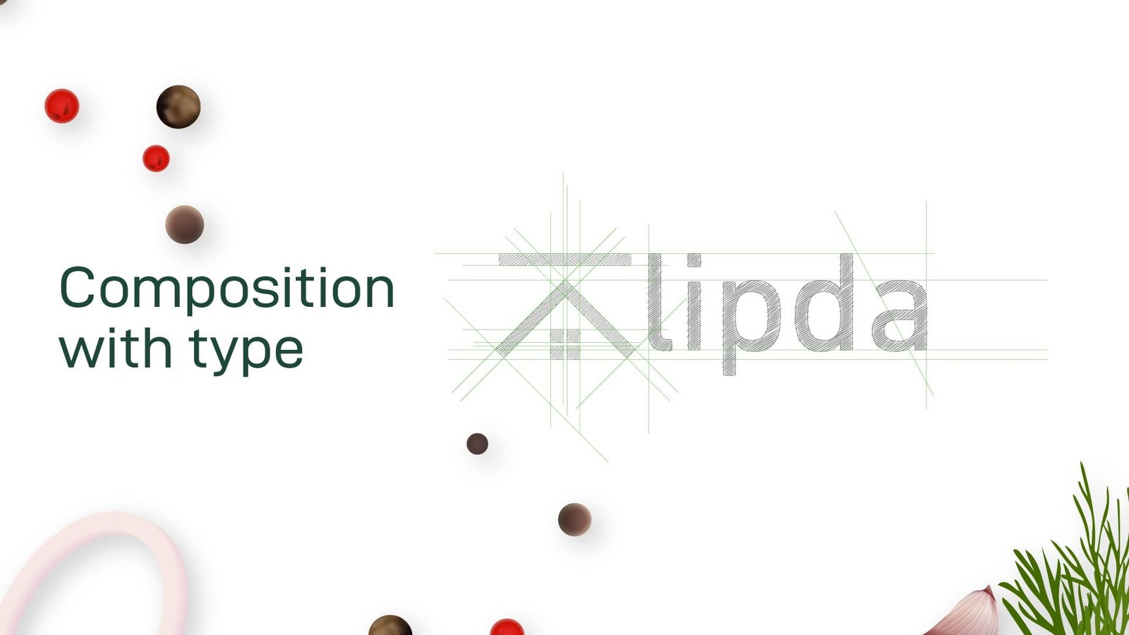
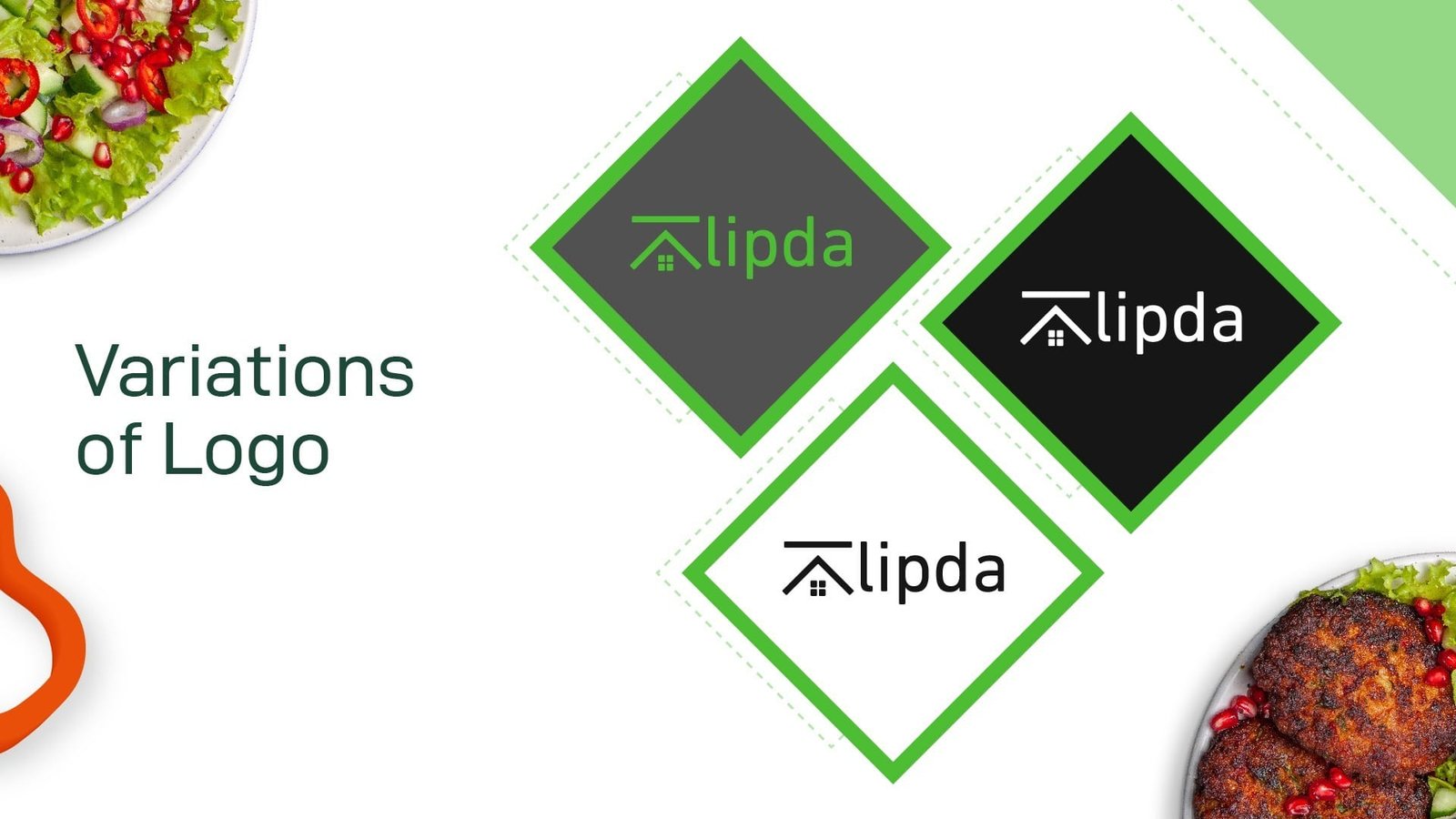
For Klipda, I creatively rotated the letter “K” from the brand name to represent a home’s roof, symbolizing comfort and warmth. Below the roof-like “K,” I added a window to complete the imagery of a house, visually conveying that the brand delivers food with the care and quality.
The logo features the color green, chosen to signify freshness, health, and natural ingredients, aligning perfectly with the brand’s ethos. This design emphasizes Klipda’s commitment to delivering wholesome food with a fresh and natural touch.
