Yopals
Logo Design | Yopals | PK 🇵🇰
Yopals is an interactive business portal and a crowd-sourced review based platform that connects local businesses with local people. Ensuring that every business gains a stable and flourished brand identity and on the same hand, customers get best service quality, organic and updated business data.
Design:
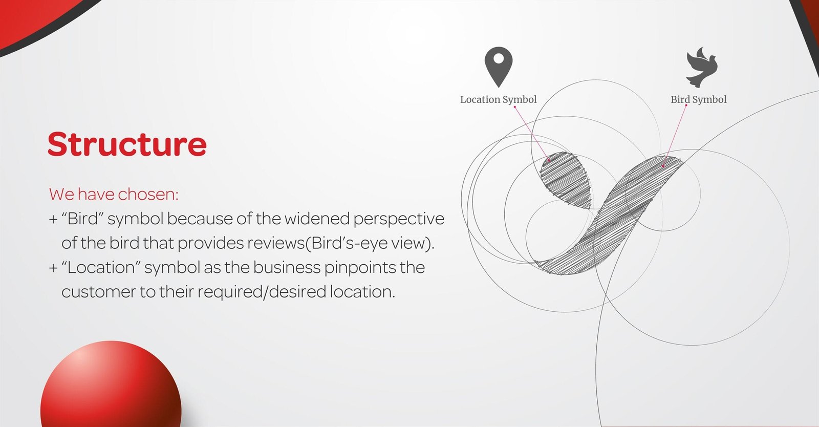
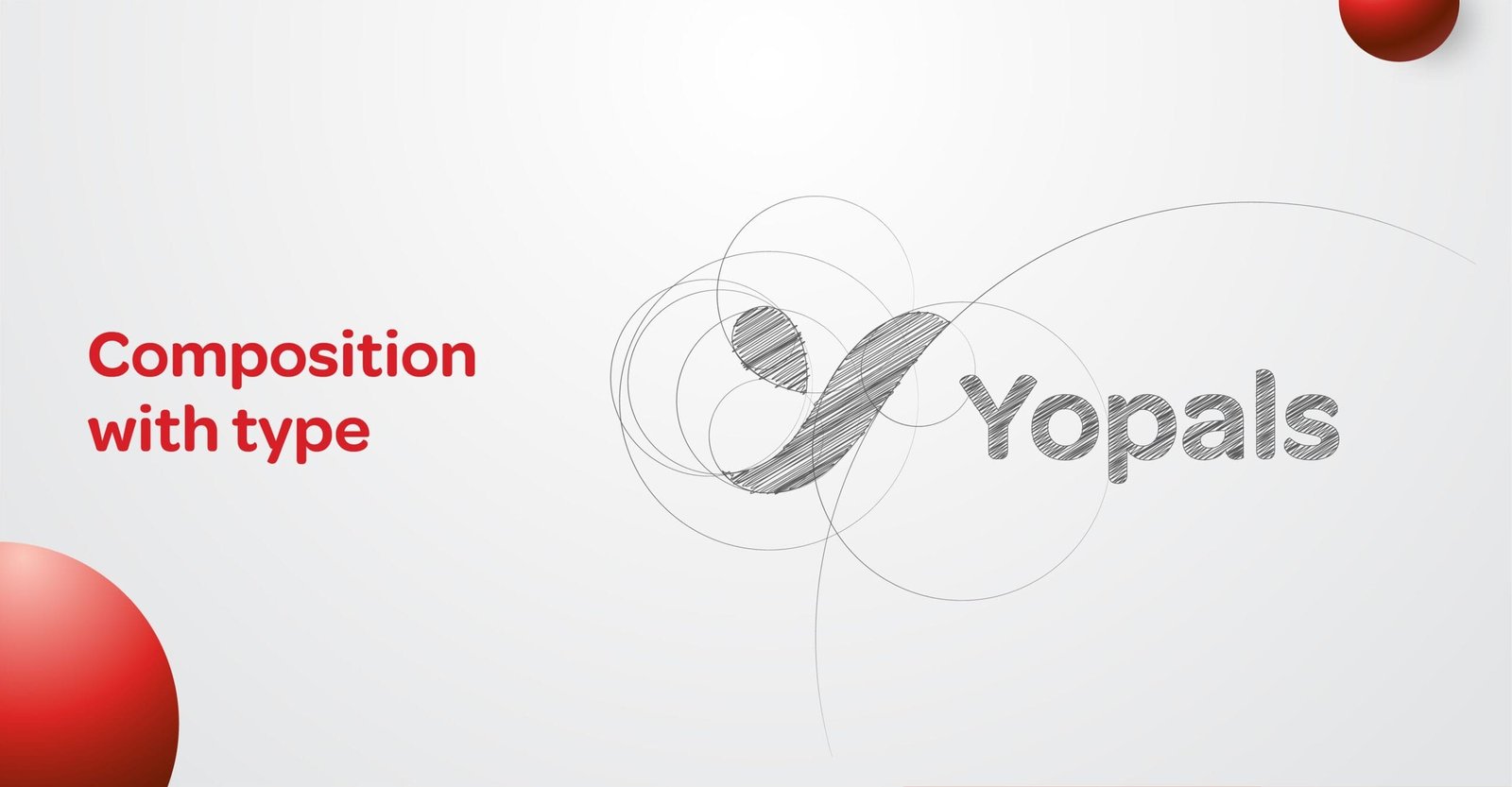
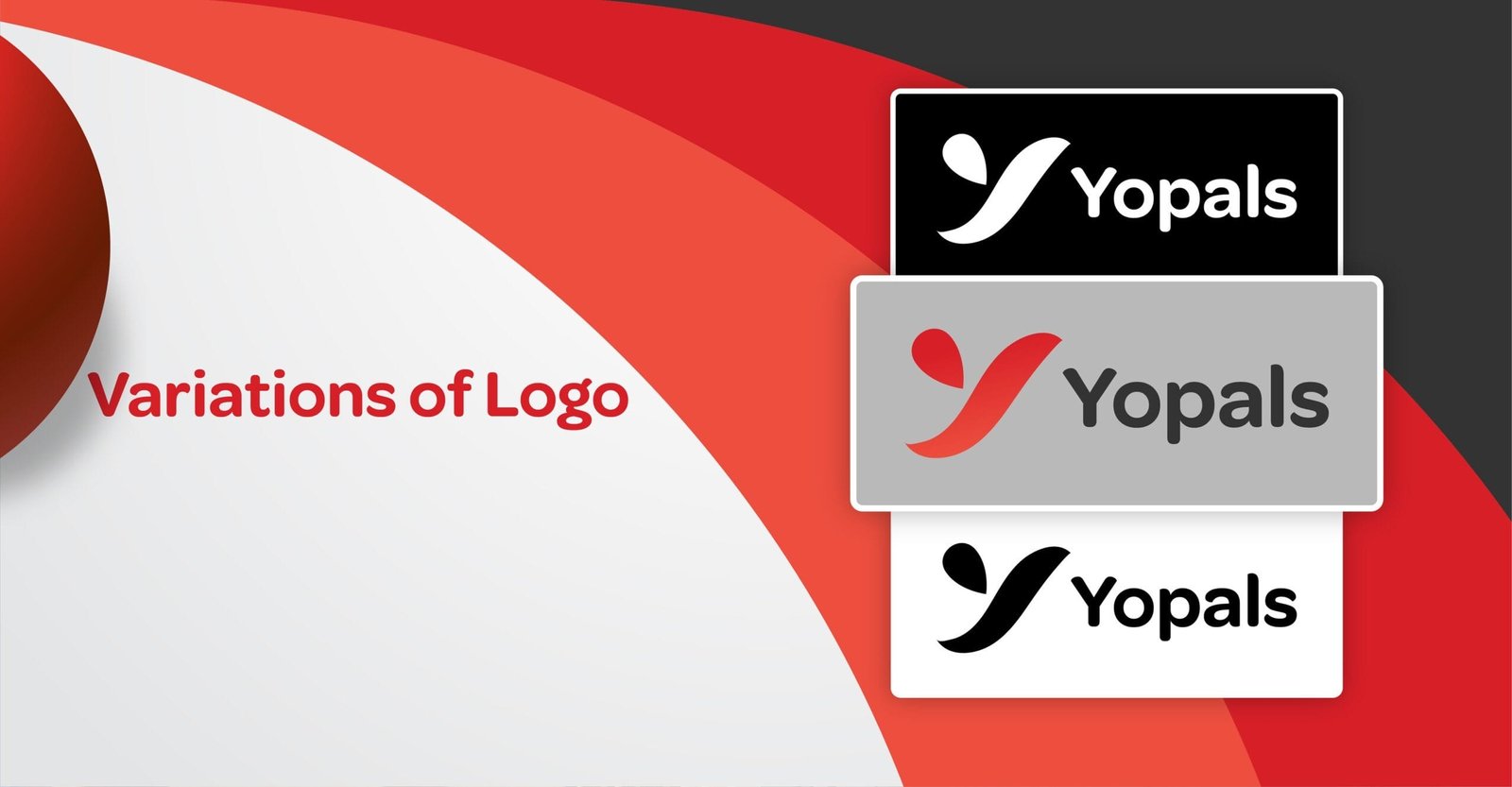
For Yopals, I crafted the letter “Y” using two distinct symbols: a location pin as the smaller slab and a bird as the larger slab of the symbol “Y”. This combination visually represents the brand’s dynamic and explorative essence, connecting movement, discovery, and locality.
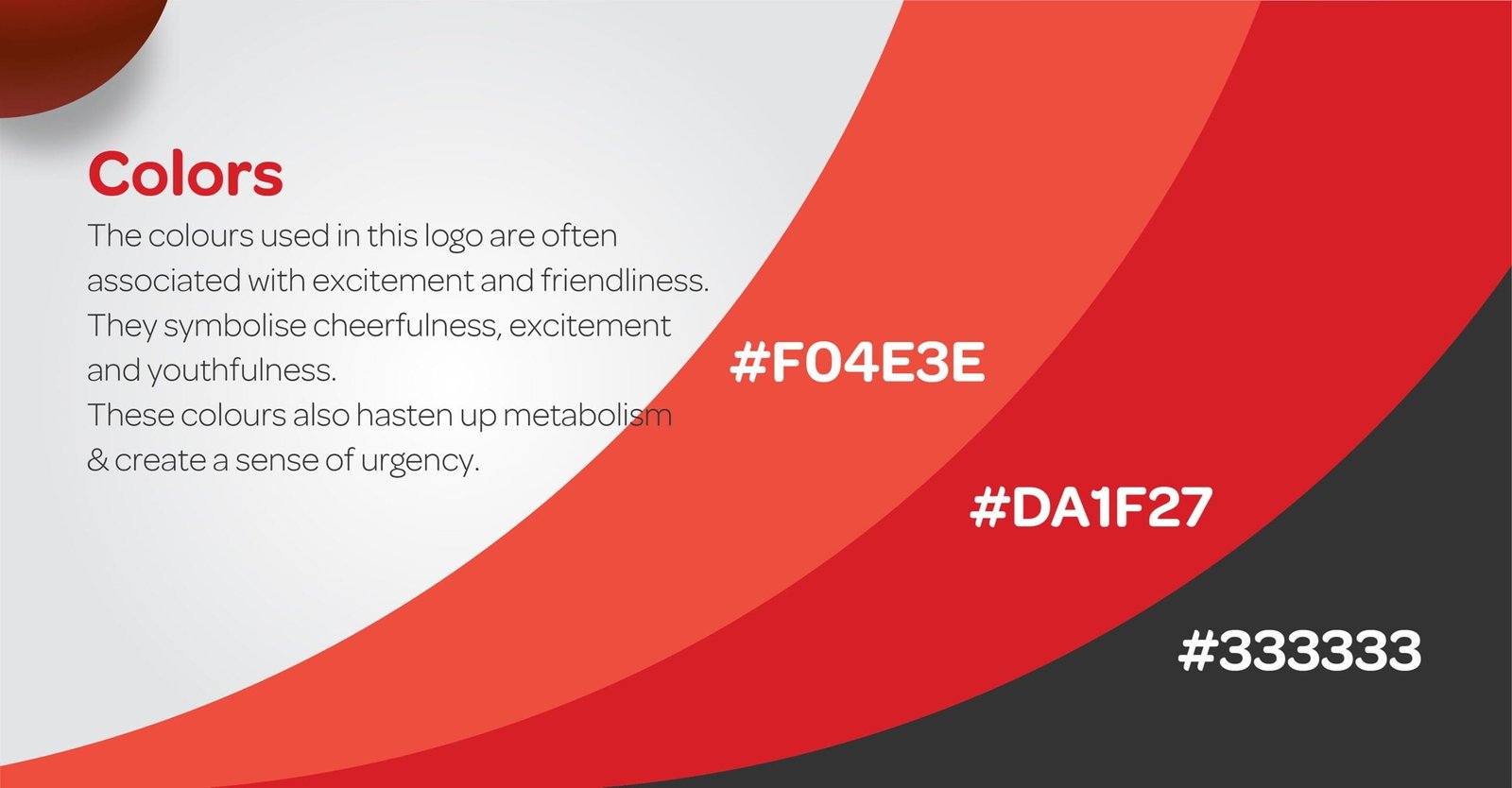
I selected orange, red, and dark grey as the primary colors. Orange and red symbolize excitement, youthfulness, and energy, while dark grey adds a sense of urgency and sophistication, reflecting the brand’s vibrant yet reliable identity. This design encapsulates Yopals’ adventurous spirit and connection to exploration.
